😎flex布局详解
flex 布局
可以看这个
容器属性
display 属性用来将父元素定义为 Flex 布局的容器,设置 display 值为 display: flex;
容器对外表现为块级元素;display: inline-flex; 容器对外表现为行内元素,对内两者表现是一样的。
我们有以下六个属性可以设置的容器上:
flex-directionflex-wrapflex-flowjustify-contentalign-itemsalign-content
flex-direction
flex-direction 定义了主轴的方向,即项目的排列方向。
row(默认值):主轴在水平方向,起点在左侧,也就是我们常见的从左到右;row-reverse:主轴在水平方向,起点在右侧;column:主轴在垂直方向,起点在上沿;column-reverse: 主轴在垂直方向,起点在下沿。
flex-wrap
默认情况下,项目是排成一行显示的,flex-wrap 用来定义当一行放不下时,项目如何换行。
假设此时主轴是从左到右的水平方向:
nowrap(默认):不换行;wrap:换行,第一行在上面;wrap-reverse:换行,第一行在下面。
flex-flow
flex-flow 是 flex-direction 和 flex-wrap 的简写,默认值是 row no-wrap。
justify-content
justify-content 定义了项目在主轴上的对齐方式。
flex-start(默认):与主轴的起点对齐;flex-end:与主轴的终点对齐;center:项目居中;space-between:两端对齐,项目之间的距离都相等;space-around:每个项目的两侧间隔相等,所以项目与项目之间的间隔是项目与边框之间间隔的两倍。
align-items
align-items 定义了项目在交叉轴上如何对齐。
flex-start:与交叉轴的起点对齐;flex-end:与交叉轴的终点对齐;center:居中对齐;baseline:项目第一行文字的基线对齐;stretch(默认值):如果项目未设置高度或者为 auto,项目将占满整个容器的高度。
align-content
align-content 定义了多根轴线的对齐方式,若此时主轴在水平方向,交叉轴在垂直方向,align-content 就可以理解为多行在垂直方向的对齐方式。项目排列只有一行时,该属性不起作用。
flex-start:与交叉轴的起点对齐;flex-end: 与交叉轴的终点对齐;center:居中对齐;space-between:与交叉轴两端对齐,轴线之间的距离相等;space-around:每根轴线两侧的间隔都相等,所以轴线与轴线之间的间隔是轴线与边框之间间隔的两倍;stretch(默认值):如果项目未设置高度或者为auto,项目将占满整个容器的高度。
项目属性
对项目设置属性,可以更灵活地控制 Flex 布局。以下六种属性可以设置在项目上:
orderflex-growflex-shrinkflex-basisflexalign-self
order
order 定义了项目的排列顺序,默认值为 0,数值越小,排列越靠前。
1 | |
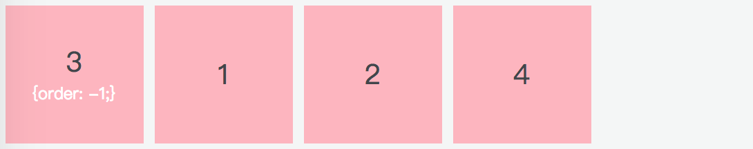
(给第三个项目设置了 order: -1; 后,该项目排到了最前面)
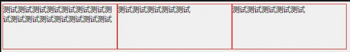
flex-grow
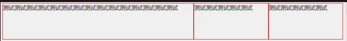
flex-grow 定义了项目的放大比例,默认为 0,也就是即使存在剩余空间,也不会放大。
如果所有项目的 flex-grow 都为 1,则所有项目平分剩余空间;
如果其中某个项目的 flex-grow 为 2,其余项目的 flex-grow 为 1,则前者占据的剩余空间比其他项目多一倍。
1 | |
(所有项目的 flex-grow 都为 1,平分剩余空间)
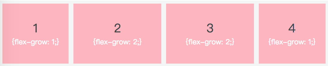
(flex-grow 属性值越大,所占剩余空间越大)
flex-shrink
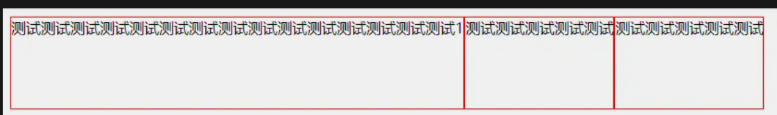
flex-shrink 定义了项目的缩小比例,默认为 1,即当空间不足时,项目会自动缩小。
如果所有项目的 flex-shrink 都为 1,当空间不足时,所有项目都将等比缩小;
如果其中一个项目的 flex-shrink 为 0,其余都为 1,当空间不足时,flex-shrink 为 0 的不缩小。
负值对该属性无效。
1 | |
(空间不足时,默认等比缩小)
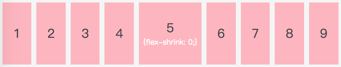
(flex-shrink 为 0 的不缩小)
flex-basis
flex-basis 定义了在分配多余的空间之前,项目占据的主轴空间,默认值为 auto,即项目原来的大小。
浏览器会根据这个属性来计算主轴是否有多余的空间。
flex-basis 的设置跟 width 或 height 一样,可以是像素,也可以是百分比。
设置了 flex-basis 之后,它的优先级比 width 或 height 高。
1 | |
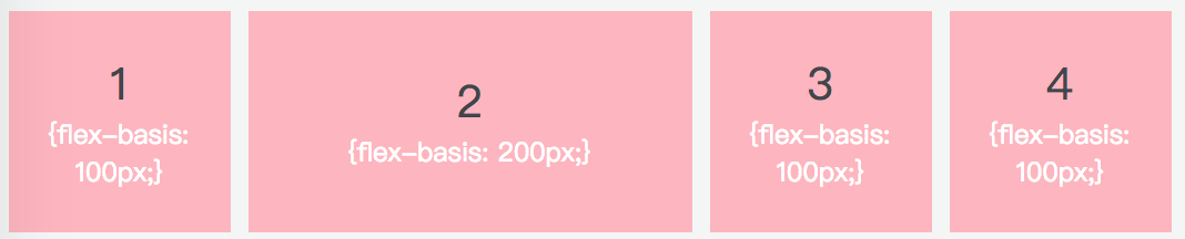
(不同的 flex-basis 值效果展示)
flex
flex 属性是 flex-grow、flex-shrink、flex-basis 的缩写,默认值是 0 1 auto,后两个属性可选。
该属性有两个快捷值:auto(1 1 auto)和 none(0 0 auto)。
auto 代表在需要的时候可以拉伸也可以收缩,none表示既不能拉伸也不能收缩。
1 | |
align-self
align-self 用来定义单个项目与其他项目不一样的对齐方式,可以覆盖 align-items 属性。
默认属性值是 auto,即继承父元素的 align-items 属性值。当没有父元素时,它的表现等同于 stretch。
align-self 的六个可能属性值,除了 auto 之外,其他的表现和 align-items 一样。
1 | |
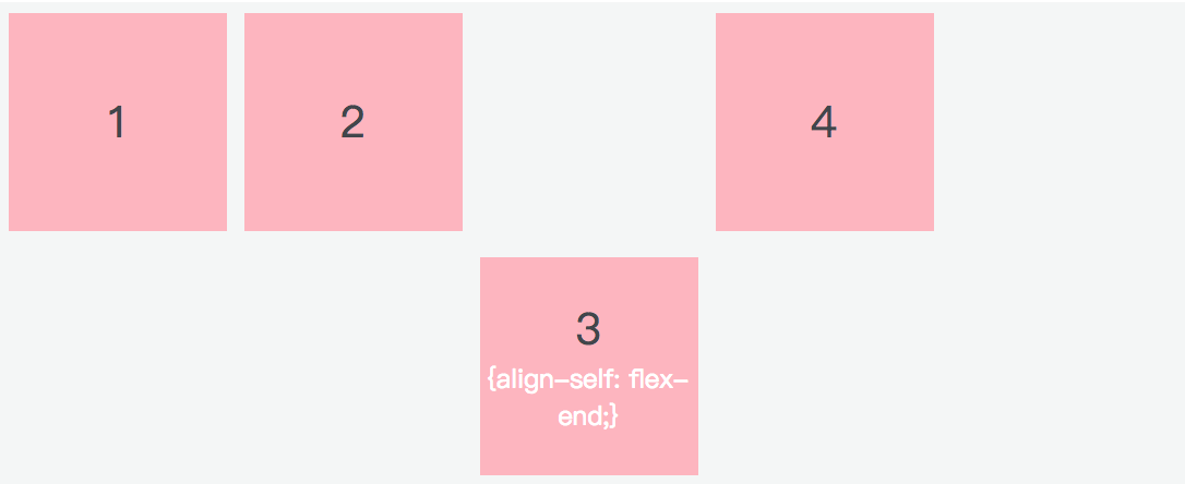
(第三个项目的对齐方式与其他不同)
注意
- 当我们为父盒子设为
flex布局之后,子元素的float,clear和vertical-align属性将失效 align-items是单行,align-content是多行
flex属性是flex-grow,flex-shrink和flex-basis的简写,默认值为0 1 auto。
flex-grow是如果有剩余空间,是否扩大,1为扩大flex-shrink是如果剩余空间不够,是否缩小,1为缩小flex-basis为项目本身的大小,默认值是auto
示例
1 | |
1 | |
1 | |
1 | |
1 | |
1 | |
1 | |
1 | |
1 | |

1 | |
1 | |
1 | |
⭐ flex 各个值的区别
下面来分别讲讲 flex:1, flex:auto, flex:0, flex:none的区别
flex 属性是 flex-grow、flex-shrink、flex-basis 的缩写,默认值是 0 1 auto,后两个属性可选。
1 | |
1 | |
1 | |
1 | |
flex : 1 和 flex : auto 的区别
flex: 1 不管内容多少,一般都是平分空间,空间大小都一致
flex: auto是根据内容的大小来分,不是均分的(除非内容都是一样,才均分)
flex: 0 和 flex: none 的区别:
flex: 0 不可扩大,可缩小,表现形式为最小内容宽度, 上图你可以看到 div 的宽度就是一个字的宽度
而flex: none 不可扩大,不可缩小,内容本身的宽度是多少就是多少